
Washington Technology Industry Association
Personalized Business Offerings
WTIA is an alliance of 1,000+ technology businesses from start-up to established. I redesigned WTIA’s homepage to optimize personalization, organization, and storytelling for desktop and mobile devices.
Position
UX Researcher & Designer
My Role
This is a solo project so I performed all project roles from research to development of a high fidelity prototype.
Mentor
Hieu Quach, Lead Experience Designer at Atlassian
Date
July 2022-September 2023
Methods & Tools
User Interviews
Competitive Analysis
Site Analytics
Heuristic Evaluation
Journey Mapping
Personas
Affinity Mapping
Information Architecture
Prototype (Figma)
Usability Testing
Table of Contents
Challenge & Solution | Context & Process | Discovery | Ideation
Solutions Deep Dive | Testing | Prototypes | Delivery | Reflection | Update
Challenge
WTIA wants to make their website the main selling point within the next 3-5 years to help boost enrollment. To do so, they want potential members to better understand what they have to offer.
Solution
WTIA’s redesigned homepage motivates prospective members to join the community with clear storytelling, organized offerings, and personalized pathways to high priority solutions. The desktop and mobile experience invites users to engage with aesthetically pleasing interactive content to learn about the WTIA community and more efficiently find information that is most relevant to their business needs.


This was wonderful. I really, really liked the design. I like the links in the banner….The membership and partnership being pulled out, I really love that. There was so much in that that I think can be useful. It was laid out in a much more digestible way so very well done.
-Heather Trestrail, Vice President of Marketing at WTIA
Context
Washington Technology Industry Association (WTIA) is a technology business association with approximately 1,000 member companies in the state of Washington. The association is considered the voice of Washington’s technology sector. WTIA’s member companies range from new business to established business with a range of challenges and expertise. The association provides valuable business resources and platforms for the intersection of ideas. The association hosts educational and training events, CEO roundtables, and executive seminars; develops affinity groups around DEI, cryptocurrency, cybersecurity, start-up incubators, and new business accelerators; influences public policy; and provides insurance, consulting, and 401(k) plans.
Process
To meet business and UX objectives, I followed a structured research plan rooted in the double diamond design process. First, I conducted four research methods (interviews, web analytics, competitive analysis and heuristic evaluation) and used three synthesis methods (persona, journey mapping, affinity mapping) to discover and define valuable insights. I turned our insights into actionable design solutions with How Might We statements and a Point of View summary. Then I designed a solution using sketching, information architecture, and a prototype in Figma. To assess our design solutions, I conducted usability testing and analyzed the insights. After three months, I delivered my findings in a presentation and research report to our stakeholders.

Project limitations: data access, employee and customer availability.
Resourcefulness: I worked around the customer availability by sourcing people from my network and usability platforms.
Discovery
I interviewed five stakeholders to identify high priority business objectives. I organized the brief and employee interviews in an affinity map to identify key themes and UX opportunities. The key objectives that emerged involve findings ways to:
Tell WTIA’s story (origin, values, testimonials)
Be member centric
Develop user awareness of consulting services
Reduce bulk and blockiness
Stakeholder Brief

I then conducted an analysis of WTIA’s web analytics via Salesforce and Google Sheets.
I learned about:
Pages with high bounce rates (homepage)
Popular search terms (start-up and resources)
Percentage of WTIA members that are startups versus the percentage of Washington businesses that are startups to understand market gaps
Note: The web analytics analysis is at a high level to respect the privacy of our stakeholder’s data
Site Analytics
A heuristic evaluation of the site allowed us to access the usability of WTIA’s current site. Based on the criteria, the high priority areas of concern were:
Flexibility and efficiency of use—create personalized pathways
Aesthetic and minimalist design—reduce irrelevant information and bulk
Recognition rather than recall—make relevant options like consulting more visible
Heuristic Evaluation

I conducted an analysis of three similar organizations (TechAlliance, Graham & Walker, Thurston EDC Center of Business and Innovation) to compare how they organize offerings and design user pathways.
I found that:
WTIA has longevity (founded in 1984) and is considered the unifying voice for the technology community in Washington
Thurston EDC has longevity (founded in 1982) and serves businesses at different stages in their development. Thurston EDA provides three clear pathways for users to choose from: start a business, grow a business, or established business. After users selected an option, they select what they are ‘ready to do’ from an organized list of options which leads to specific resources that meet the user’s need.
Graham & Walker offers aesthetically pleasing and interactive features, limits bulk, organizes information and offers clear pathways.
Competitive Analysis

User Insights
I conducted four interviews with two business founders (e-learning and Human Resources), a product manager, and a data scientist (experience with technology accelerators and enterprise). I sourced three of the interviewees from my professional network and found one on Respondent.
After conducting the user interviews, I synthesized the research using affinity mapping to understand reoccurring frustrations, wants, and questions.
Interviews

I found that our users want a clear pathway to achieve their business goals and an efficient way to find what they need on WTIA’s site. These wants connect to our stakeholder’s goals—develop awareness of consulting, create a clearer story and become more member centric.

Based on my insights from the user interviews, I designed a user persona around the founder of a start-up company. I chose to focus on founders of start-ups because start-ups are WTIA’s primary focus; the association first started by providing resources to start-ups and their current goal is to become more of an incubator.
Core elements of our user persona include:
Goals: Roadmap and coaches to guide business growth
Motivations: Community & coaches, special entrepreneur offerings, and core values
Frustrations: Managing tasks & resources, finding investors & customers
Personas

During our user interviews, I documented the experience of our users as they moved through WTIA’s website. I translated the most common and frequent behaviors and thoughts of our users into a synthesized journey map. The journey map emphasizes the key insight that users are confused about and overwhelmed by what WTIA offers and how those offerings connect to their specific needs.
User Journey Map

Based on my research insights, I brainstormed ways to redesign a positive end-to-end experience for our users. First, I focused on a key strength— the personalized user experience prospective members receive after they request to learn more about membership. The research taught me that WTIA responds to prospective members using a personalized email tailored to the specific needs of each marketing persona (ex. personalized solutions for the founder of a start-up company). WTIA also provides one-on-one consultant sessions with seasoned professionals to ensure prospective members receive the guidance they need to make challenging business decisions. Thus, I prioritized bringing this personalized experience to the beginning of a user’s journey starting with the homepage. I then focused on converting pain points to solutions and mapped it out in a diagram.

Homepage Redesign Goal
Find solutions that improve usefulness of the homepage in considering membership
Ideation
To improve the retention of site visitors, I chose to redesign WTIA’s homepage. I defined our UX objectives using a point of view summary.

I also wrote ‘How Might We’ statements:
How might we allow users to identify what type of business they are which leads to products that are a good fit?
How might we develop a story and consulting visibility?
I brainstormed ideas by sketching solutions to the homepage. My initial sketches focus on ways to improve the overall usefulness of the homepage by emphasizing key brand terms, aligning offerings to WTIA’s offering structure and marketing personas, and hiding irrelevant information.
Sketch samples:
Sketching

Information Architecture
I created an information architecture diagram to visualize the structure of three main sections of the homepage that:
1. Organize offerings based on marketing personas
2. Organize WTIA’s program offerings in header
3. Align ‘What We Do’ with WTIA’s offering structure


To alleviate confusion about offerings & value
Organize. Emphasize. Personalize.
Solutions
Key Finding #1: Users are confused about what WTIA does (hero header & footer)
When users arrived on the homepage and view the hero header, they express confusion about WTIA does.
Solution: Develop a clear statement that explains what WTIA does, feature key brand terms and core offerings
Redesign the header with a stronger story that reflects what WTIA offers through the use of key words and color contrasting. Allows users to interact with the hero header by clicking on key terms which lead to a page with further information about offering. Redesign the header to include the term ‘consulting’ next to services since users are unaware of this offering and WTIA wants to make it more apparent.

Our stakeholder would like an updated footer as well—redesign the footer to make it more organized with bold, clearly defined sections and available offerings. Place high priority offerings at the top of each section (ex. ‘Business Consulting’ under ‘Services and Consulting’).

Key Finding #2: Users are confused about the offerings and feel they are all over the place (‘What We Do’ section)
When users view WTIA’s offerings in the ‘What We Do’ section of the homepage, they feel the visual structure of the offerings is confusing and unorganized.
Solution: Align the ‘What We Do’ section to WTIA’s offering structure and hide irrelevant information
Redesign the ‘What We Do’ section to clarify what WTIA offers.
Align the information to WTIA’s offering structure by breaking the offerings into two comprehensive groups (1. Services and Consulting 2. Programs and Community)
Organize offerings with accordion tabs to hide irrelevant information and reduce the user’s cognitive load
Provide a description of each grouping to further clarify what WTIA does

Key Finding #3: Users are unsure about how WTIA can support their specific business needs
After browsing the homepage and various parts of the website, users are unsure about how WTIA would meet their specific needs. Alleviate the tedious and lengthly process users are experiencing as they search for relatable solutions.
Solution: Organize offerings based on WTIA’s marketing personas and eliminate bulk
Design a ‘Solutions for You’ section that personalizes the user experience by directly connecting users to relevant solutions based on WTIA’s marketing personas. Offer three tabs for users to choose from depending on how they identify: 1. New business 2. Growing business 3. Established business. Users can then choose from a variety of offerings that are grouped by likeness.

Key Finding #4: Users want to know why they should trust WTIA
After browsing the homepage and various parts of the website, users are unsure if they should trust WTIA to provide them with the right solutions. Some folks express that WTIA might be a jack of all trades but a master of none.
Solution: Develop a stronger story with anecdotes, statistics, and testimonials.
Design a ‘Join the Community’ section that builds on WTIA’s value through storytelling. Provide quantifiable measurements of growth as well as qualitative evidence of their success: who they support, how long they’ve been around, what businesses are saying about the value of membership, and which elite organizations they partner with.

Key Finding #5: Users were confused about the relevance of the ‘What’s New’ section
Users feel the ‘What’s New’ section on the homepage doesn’t have a clear focus on what was most relevant to users.
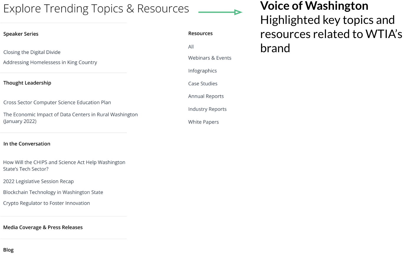
Solution: Design a topics and resources section that clearly shows the scope of relevant content offered
Design an ‘Explore Trending Topics & Resources’ section that clarifies what types of resources and topics are available to users. Have a clear directory with samples allows users to see what’s available and relevant in a concise manner. Emphasize WTIA’s strength as the voice of Washington.
Usability Testing
I conducted usability tests on the new design with 10 participants via Usabilityhub to better understand how users feel about the product’s usefulness and discoverability. The results show the product is useful and business solutions can be efficiently accessed.

Desktop Prototype
Organize offerings in header and craft a clear mission statement that clearly explains what WTIA does
Align ‘What We Do’ to WTIA’s offering structure, group offerings, and hide irrelevant information
Organize offerings based on WTIA’s marketing personas to personalize experience and help users efficiently find solutions
Interactive cards hide information while featuring initiatives and affinity groups
Sidebar navigator provides efficient way to find information on the homepage
Mobile Prototype
In addition to a desktop prototype, I built a mobile version of the homepage to demonstrate how to restructure the content.

Delivery
At the end of three months, I delivered a concise presentation and a detailed final report to our stakeholders.
Note: I also delivered a presentation midway through the project to update our stakeholder on our progress.


Reflection
Researching and designing a prototype for WTIA was one of the most thought provoking projects I worked on because it was my very first UX project. I learned how to understand a user’s end-to-end experience, identify high-priority problems, design and iterate low and high-fidelity designs, conduct usability testing to assess solutions, and deliver findings in a concise presentation and detailed final report. Each phase of the process had a steep learning curve.
Honing research methodology: I learned how to choose appropriate research methods, source and conduct interviews, analyze data, synthesize information, extract key findings, and formulate statements that define the UX opportunities.
Adapting to challenges: One of the research challenges I faced was gathering survey responses from current WTIA members under time restraints. To work around the challenge, I met with employees to gain an inside perspective on what they need and what they feel members need. Another challenge I faced was conducting interviews with direct WTIA members. I worked around the challenge by interviewing people who fit WTIA’s marketing personas.
What else I would do: I recommend conducting a card sorting test to see how folks group the offerings. We based the groupings on insights received during interviews and feel a deeper dive can provide greater insights.
Prototyping Inspiration: To design efficient, digestible ways of presenting offerings, I found inspiration from top technology companies like IBM and Atlassian. I also learned from the design resources of industry leaders (Atlassian Design System, Google Design).
Update
As of April 12, 2023, WTIA implemented the following updates on their website which connect to my research insights:
Updated homepage: Homepage now features more storytelling and consolidated core offerings — based on my findings that show 1. the homepage should be redesigned due to its high bounce rate 2. the homepage should alleviate user confusion about offerings - users need clear storytelling and organized/concise core offerings
Storytelling | Voice of Tech: Features ‘Voice of Tech’ in their hero header - based on my competitive analysis that found WTIA’s reputation as the ‘Voice of Tech’ is a core strength worth featuring
Storytelling | Empathize with core audience: Section dedicated to storytelling that empathizes with core audience, specifically small to mid-sized businesses, and makes clear that consulting support is available - based on the needs of my persona, the research finding that shows approximately 60% of members are small to midsized businesses, and the Stakeholder’s need to make WTIA’s consulting more visible.
Consolidated Core Offerings: The ‘What We Do’ section went from 9 core offerings to 5 core offerings - based on my recommendation to reduce bulk in relation to user feedback that the amount of information is overwhelming and core offerings are unclear.
See updated site here.